Choosing interior colors is where most homeowners freeze. Here's a simple process to land colors you'll love — and avoid expensive mistakes.
Color is the most exciting and the most nerve-wracking part of any interior paint project. Pick well and your home feels fresh, calm, and pulled-together; pick poorly and you're living with a color you dislike or repainting an entire room. The good news: choosing colors you'll love is a process, not a gamble. Here's how to do it right in a Tampa home.
Start with what stays
Before you look at a single paint chip, take stock of the things in the room that aren't changing: flooring, countertops, cabinets, large furniture, tile, and fixed finishes. Your wall color needs to work with those, not fight them. Pull your palette from the undertones already in the room — a warm wood floor leans your whites and neutrals warmer; cool gray tile pushes them cooler.
Understand Florida light
This is the step out-of-state guides miss. Tampa's bright, warm natural light dramatically affects how color reads on a wall. A gray that looked perfect in the store can turn blue, lavender, or green in your living room. Strong Florida sun tends to wash colors out and pull them warmer, so a shade often reads lighter and warmer on your wall than on the chip.
Check north vs. south rooms
Room orientation matters. North-facing rooms get cooler, more even light, which can make colors feel grayer or bluer. South- and west-facing rooms get intense warm light, especially in the afternoon, which amplifies warmth and brightness. The same color can feel like two different shades in two rooms of the same house.
Always test on the wall
This is the single most important rule: never commit to a color from a tiny chip. Paint large test patches — at least a couple of feet square — directly on your wall, or on poster board you can move around the room. Then live with them. Look at each color in the morning, at midday, and in the evening under your lamps. A color that's perfect at noon can feel completely different after dark.
Build a cohesive whole-home palette
If you're painting multiple rooms, resist the urge to choose each one in isolation. The most pulled-together homes use a cohesive palette: one or two main wall colors that flow from room to room, a consistent trim color throughout, and the occasional accent. This makes a home feel larger and more intentional, and it makes sightlines from one room to the next feel calm rather than chaotic.
Don't forget trim and ceilings
Trim color is a quiet workhorse. A crisp, consistent trim color ties everything together and makes wall colors pop. Most homes look best with a single trim white used throughout. Ceilings are usually a flat white, but a subtle tint can warm up a room beautifully — another reason to test in your space.
Popular Tampa interior colors right now
Trends come and go, but a few directions consistently work well in Tampa homes: warm whites and soft off-whites that feel bright without being stark; greige (gray-beige) neutrals that flex with both warm and cool furnishings; soft coastal blues and greens that nod to the water; and deep, moody accent colors on a single feature wall or built-in for contrast. The right choice is always the one that works with your light and your finishes.
When to bring in a pro
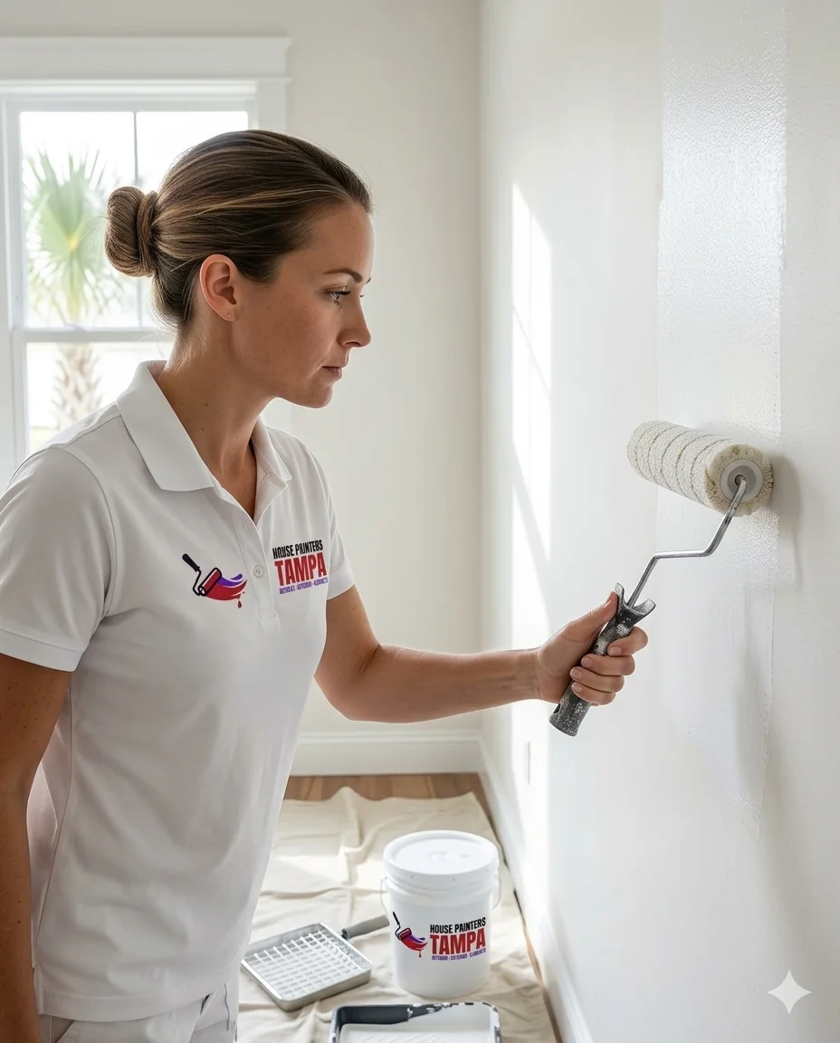
If you're staring at a wall of chips feeling paralyzed, a color consultation is worth it. A professional brings fan decks, paints real test patches, and helps you account for your light, your finishes, and how the colors flow — so you choose with confidence and avoid the costly mistake of repainting. Because we're the ones applying it, the colors we recommend are ones we know will look and wear beautifully.
Choose with confidence
Great interior color comes down to a simple process: start with what stays, respect your Florida light, test big patches on the wall, and build a cohesive palette across the home. Take your time on this step — it's the cheapest part of the project and the one you'll see every day. And if you'd like help, we offer color consultation as part of our interior painting service.
Choosing the right sheen for each room
Color gets all the attention, but sheen quietly shapes how a room looks and lives. Flat and matte finishes hide wall imperfections and give a soft, modern look, making them great for ceilings, formal rooms, and bedrooms — though they're harder to scrub. Eggshell and satin offer a slight glow and much better washability, which is why they're popular for living areas, hallways, and kids' rooms. Semi-gloss is the workhorse for trim, doors, kitchens, and bathrooms, standing up to moisture and frequent cleaning. Using the right sheen in the right place makes the whole job look professional.
Common color mistakes to avoid
A few predictable missteps cause most color regret. The first is choosing from a tiny chip under store lighting instead of testing on the wall in your own light. The second is ignoring undertones — that 'simple gray' that turns out lavender or green once it's up. The third is picking each room in isolation so the home feels disjointed from one space to the next. And the fourth is going too bold across an entire large room when the same color would sing as an accent. Slowing down and testing solves nearly all of them.
Trends vs. timeless
It's fine to enjoy a trend, but be strategic about where you apply it. Walls are relatively easy and inexpensive to repaint, so a trendy wall color is low-risk. Built-ins, cabinetry, and anything labor-intensive to change are better kept in timeless tones, with trends expressed through easily swapped accents like décor, textiles, and art. That way your home feels current without locking you into a costly redo when styles shift.
Putting it all together
When you combine these pieces — a palette drawn from your fixed finishes, colors tested in your actual Florida light, the right sheen for each room, and a cohesive flow throughout the home — you end up with interiors that feel intentional and calm rather than scattered. That's the difference between a house that's been painted and a home that's been designed. It doesn't require a designer's eye, just a careful process and a willingness to test before you commit.